
6 种 AI Logo 提示词策略:从零基础到精准生成的完整指南
一句话总结:不同起点的人需要不同的提示词策略。本文整理了 6 种经过实测的 Logo 生成提示词,每种都附完整 Prompt(中英双语),覆盖从"完全没想法"到"精确复刻"的全部场景。
背景
我用 AI 给自己的频道「黑粉科技」做了全套品牌设计——Logo、头像、Banner、封面模板,全程零设计基础、零成本。
过程中我发现:大多数人 Logo 生不好,不是工具的问题,是提示词策略选错了。
你脑子里完全没画面,和你已经知道想要什么,用的 prompt 应该完全不同。
实际采用的 Logo
在介绍 6 种策略之前,先看我最终用的 prompt 和思路。
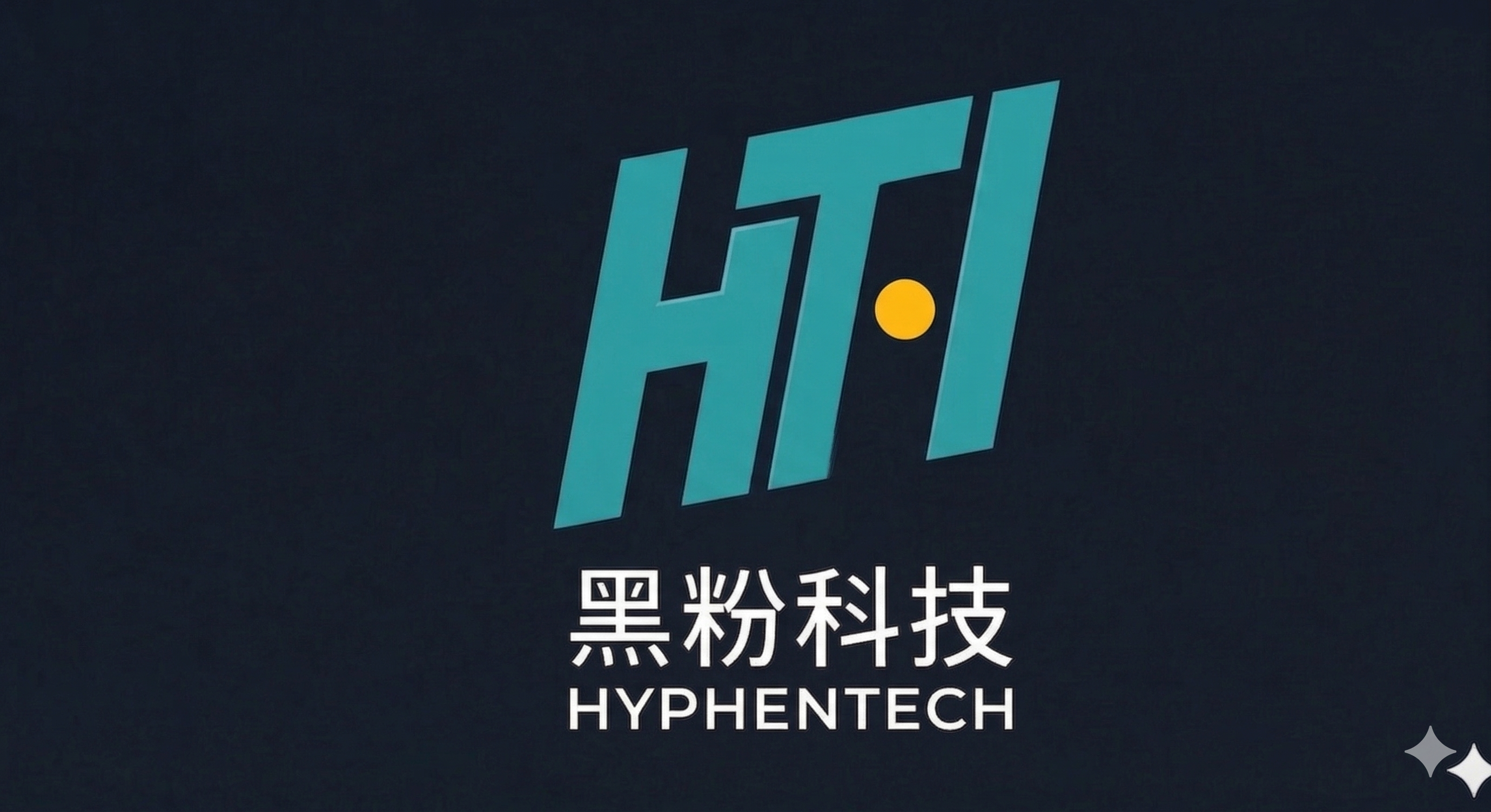
品牌概念
Logo 是字母 H 和 T 的融合(HyphenTech 的缩写),组成一扇"门"的形状:
- H = 门框:两根立柱 + 横梁
- T = 门内透出的光:T 的竖线是从门内透出的光柱
- 琥珀圆点 = 门把手:唯一的暖色,代表"技术是冷的,但这扇门是为你打开的"
最终生成 Prompt
English:
Minimal geometric logo mark made ONLY from straight lines and one circle.
The letter H and the letter T are merged together sharing structural lines
to form a shape that resembles an open doorway. H provides two vertical
strokes and a horizontal crossbar. T shares H's horizontal bar as its top,
with T's vertical stem going downward through the center — this center line
reads as light or a path through the door. A single small solid amber circle
(#FFB300) sits on the right vertical stroke as a door handle. ALL lines are
straight — no triangles, no arrows, no diagonal lines, no curves except the
one amber circle. Color: cyan #13C2C2 lines on deep navy-black #0F1923.
Below: "黑粉科技" in white #E8E8E8 and "HYPHENTECH" in cyan #13C2C2.
Flat vector, no gradients, no shadows.
中文:
极简几何 Logo,仅使用直线和一个圆形。字母 H 和 T 共享结构线条,合并成一扇
打开的"门"的形状。H 提供两根竖线和一根横线(门框),T 的竖线从中间向下延伸
穿过门框——看起来像从门内透出的光线。一个实心琥珀色小圆点(#FFB300)位于右
侧竖线上,作为门把手。所有线条必须是直线——不要三角形、箭头、对角线、曲线
(门把手圆点除外)。颜色:青色 #13C2C2 线条,深藏青黑 #0F1923 背景。下方
文字:"黑粉科技"白色 #E8E8E8,"HYPHENTECH"青色 #13C2C2。扁平矢量风格,
无渐变,无阴影。
关键心得
这个 prompt 之所以能成功,是因为在写 prompt 之前,我已经花了时间想清楚三件事:
- 品牌的核心隐喻(门/入口)
- 严格的色板约束(只有两种颜色 + 一个点缀)
- 明确的排除项(不要什么比要什么更重要)
6 种提示词策略
策略 1:从零探索型 — 完全没想法时用
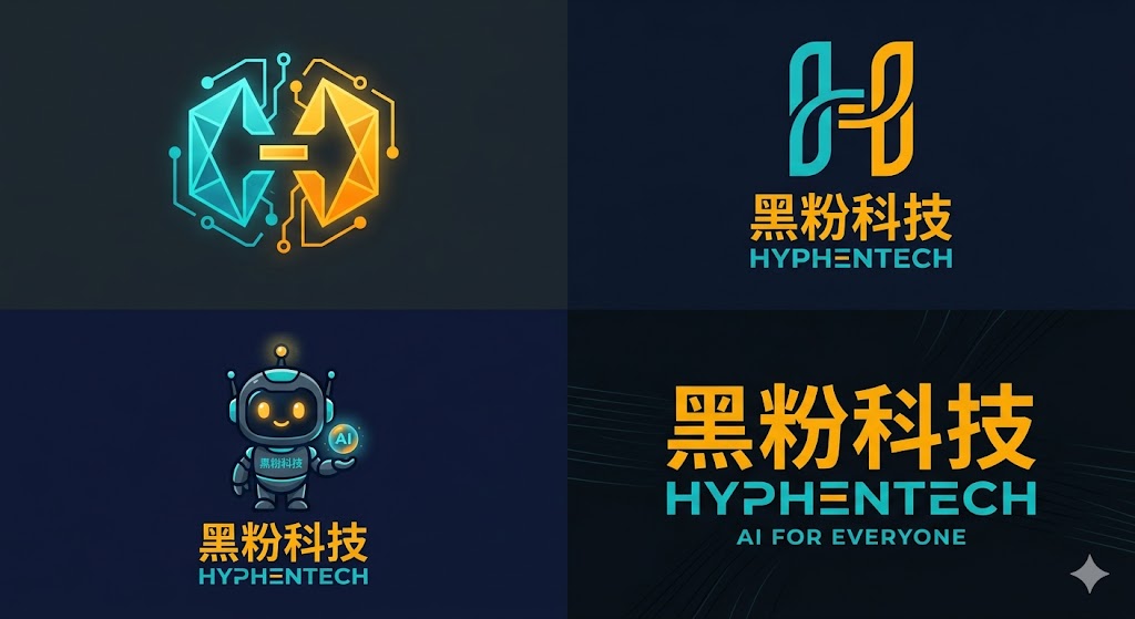
适合:刚起步、没有任何视觉想法的新人。让 AI 先出多个方向,你再从中选。
English:
I have NO visual idea for my logo. Help me explore.

Brand context:
- Channel name: 黑粉科技 (HyphenTech)
- Content: AI tutorials and tool reviews for non-technical people
- Personality: professional but approachable, like a smart friend explaining things
- Colors: dark theme, cyan (#13C2C2) + amber (#FFB300)
- Audience: Chinese-speaking, age 20-40, curious about AI but intimidated by tech jargon

Generate 4 COMPLETELY different logo directions in a 2×2 grid:
- Top-left: Abstract geometric mark (no text)
- Top-right: Lettermark using "H" or "黑"
- Bottom-left: Mascot or character-based (simple, not childish)
- Bottom-right: Pure typographic (text only, stylized)

Each should feel like it belongs to a different design agency.
Maximum contrast between the four. Dark background for all.
中文:
我完全没有 Logo 的视觉想法,请帮我探索方向。

品牌信息:
- 频道名:黑粉科技(英文 HyphenTech)
- 内容:面向非技术人群的 AI 教程和工具测评
- 气质:专业但亲切,像一个聪明的朋友在解释事情
- 配色:暗色系,青色(#13C2C2)+ 琥珀色(#FFB300)
- 受众:中文用户,20-40岁,对 AI 好奇但被技术术语吓到

请生成 4 个完全不同的 Logo 方向,以 2×2 网格排列:
- 左上:抽象几何图标(无文字)
- 右上:字母标志,用 "H" 或 "黑" 字
- 左下:吉祥物/角色类(简洁,不幼稚)
- 右下:纯文字排版设计(仅文字,有设计感)

四个方向的风格差异要尽可能大,像出自四家不同设计公司。全部使用深色背景。
使用要点:
- 第一轮不要追求完美,追求方向多样性
- 从 4 个结果中挑 1 个方向,再用策略 2 或策略 3 深入
策略 2:精准描述型 — 脑中有画面时用
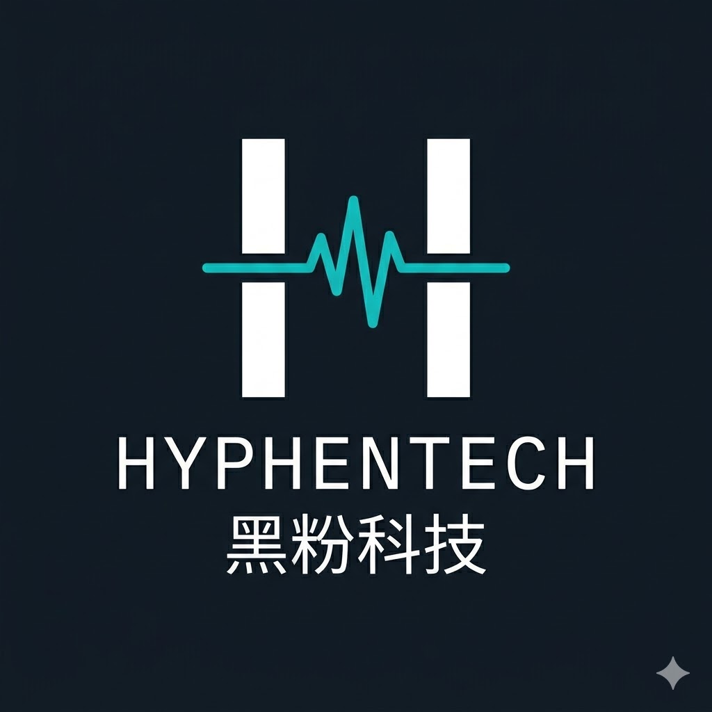
适合:已经想好形状、颜色、结构,需要 AI 精确执行。
English:
Logo design with exact specifications:

Shape: The letter "H" constructed from two vertical bars connected
by a horizontal bar. The horizontal bar is a glowing pulse/waveform
line (like an audio or heartbeat signal) instead of a straight line.

Typography: "HYPHENTECH" below the mark in IBM Plex Sans or similar
monospace-inspired sans-serif, letter-spacing: 0.15em. Below that,
"黑粉科技" in Noto Sans SC Medium, 50% the size of the English text.

Colors (strict):
- Mark: cyan (#13C2C2) for the pulse line, white (#E8E8E8) for the
  two vertical bars
- Text: white (#E8E8E8) for "HYPHENTECH", muted gray (#9CA3AF) for
  "黑粉科技"
- Background: #0F1923

Exclusions: NO gradients, NO shadows, NO 3D effects, NO rounded
corners on the H bars. Flat vector only.

Show the logo centered on a 1:1 square canvas.
中文:
Logo 设计,精确规格如下:

形状:字母 "H" 由两根竖条构成,中间的横条不是直线,而是一条发光的脉搏/
波形线(类似心电图或音频波形信号)。

字体排列:图标下方 "HYPHENTECH",使用 IBM Plex Sans 或类似等宽感无衬线体,
字间距 0.15em。再下方 "黑粉科技",使用思源黑体 Medium,大小为英文的 50%。

颜色(严格执行):
- 图标:青色(#13C2C2)用于波形线,白色(#E8E8E8)用于两根竖条
- 文字:白色(#E8E8E8)"HYPHENTECH",灰色(#9CA3AF)"黑粉科技"
- 背景:#0F1923

排除项:禁止渐变、禁止阴影、禁止3D效果、竖条不要圆角。纯扁平矢量。

Logo 居中展示在 1:1 正方形画布上。
使用要点:
- 越具体越好:颜色给 hex 值,字体给名称,间距给数值
- "排除项"比"想要的"更重要——AI 特别容易加渐变和阴影
策略 3:逆向还原型 — 看到喜欢的 Logo 想做类似的


适合:你看到某个品牌的 Logo 很喜欢,想做一个同风格但属于你自己的。
English:
Reference the visual aura of the uploaded Logo and design a brand-new Logo in the same style:

Apply this feeling of confidence to the new Logo of "黑粉科技" (HyphenTech), which is a technology channel aimed at non-technical people.
中文:
参考我上传的 Logo 的视觉气质,设计一个同风格但全新的 Logo:

将这种自信感应用到"黑粉科技"(HyphenTech)的新 Logo 上,
这是一个面向非技术人群的科技频道。
使用要点:
- 描述参考 logo 的"气质"而不是形状,避免抄袭
策略 4:关键词爆破型 — 有行业感觉但没视觉画面

适合:你能说清品牌的感觉和关键词,但完全不知道该长什么样。
English:
Design a logo for a tech education YouTube channel called "黑粉科技"
(HyphenTech).

Do NOT literally illustrate the keywords below — instead, use them
as emotional and conceptual fuel:

1. Decode — making complex things simple
2. Midnight — dark, focused, late-night coding energy
3. Bridge — connecting tech experts and beginners
4. Pulse — alive, rhythmic, always updating
5. Craft — careful, deliberate, not mass-produced

Requirements:
- Icon/mark only, NO text in the logo
- Abstract geometric shape preferred
- Color palette: cyan (#13C2C2) as primary, amber (#FFB300) as
  subtle accent, on dark background (#0F1923)
- Must work at 64px and 512px
- Clean vector style, no photorealistic rendering
- Output as a centered logo on dark background
中文:
为科技教育 YouTube 频道"黑粉科技"(HyphenTech)设计一个 Logo。

不要直接图解下面的关键词——把它们当作情感和概念上的燃料:

1. 解码(Decode)——把复杂的东西变简单
2. 午夜(Midnight)——暗色、专注、深夜写代码的能量
3. 桥梁(Bridge)——连接技术专家和初学者
4. 脉搏(Pulse)——有活力、有节奏、持续更新
5. 手艺(Craft)——用心、精致、不是流水线产品

要求:
- 仅图标,Logo 中不包含任何文字
- 偏好抽象几何形状
- 配色:青色(#13C2C2)为主,琥珀色(#FFB300)为微量点缀,
  深色背景(#0F1923)
- 必须在 64px 和 512px 两种尺寸下都清晰
- 干净的矢量风格,不要写实渲染
- 深色背景上居中展示
使用要点:
- 关键是"不要直接图解"这句话——否则 AI 会画一个桥 + 一个脉搏 + 一个锤子
- 5 个关键词是给 AI 的情绪方向,不是形状指令
策略 5:风格迁移型 — 用设计运动驱动
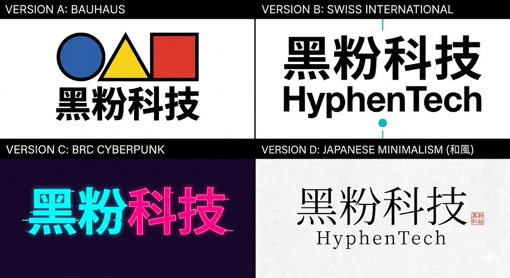
适合:你喜欢某种设计风格(包豪斯/赛博朋克/日式极简等),想看同一品牌在不同风格下的效果。
English:
Design 4 versions of a logo for "黑粉科技" (HyphenTech) — a tech
education channel. Same brand, 4 radically different design movements.
Show all 4 in a 2×2 grid with labels.

Version A — BAUHAUS:
Primary geometric shapes only (circle, triangle, square). Bold primary
colors (red, blue, yellow) on white. Thick black outlines.
Futura-style font. Asymmetric composition.

Version B — SWISS INTERNATIONAL:
Strict grid, Helvetica Neue, black and white with one cyan (#13C2C2)
accent element. Maximum whitespace. Information hierarchy through
size contrast only.

Version C — CYBERPUNK:
Glitch effects, neon glow, CRT scanlines. Chinese characters "黑粉科技"
as the dominant element. Dark purple (#1a0a2e) background with electric
cyan (#13C2C2) and hot pink (#FF0066) neon.

Version D — JAPANESE MINIMALISM (和風):
Generous whitespace, thin hairline strokes, subtle washi paper texture.
One small red hanko/seal stamp as the only color accent. Characters in
elegant brush-inspired but modern typeface.

All 4 must include the text "黑粉科技". Each should feel like it comes
from a completely different designer.
中文:
为"黑粉科技"(HyphenTech)设计 4 个版本的 Logo——同一个品牌,4 种完全
不同的设计流派。以 2×2 网格展示,标注流派名称。

版本 A — 包豪斯(BAUHAUS):
只用基础几何形(圆、三角、方形),大胆的红蓝黄三原色配白底,粗黑轮廓线,
Futura 风格字体,不对称构图。

版本 B — 瑞士国际主义(SWISS INTERNATIONAL):
严格网格,Helvetica Neue 字体,黑白为主,仅一个青色(#13C2C2)点缀元素。
大面积留白,仅通过字号大小建立层级。

版本 C — 赛博朋克(CYBERPUNK):
故障效果、霓虹发光、CRT 扫描线。中文"黑粉科技"作为主要元素。深紫色
(#1a0a2e)背景,电子青(#13C2C2)和粉红霓虹(#FF0066)。

版本 D — 日式极简(和風):
大面积留白,极细发丝线条,淡和纸质感。唯一的色彩点缀是一个小红色印章。
字体使用现代但有书法感的优雅字体。

四个版本都必须包含"黑粉科技"文字。每个版本要像出自完全不同的设计师之手。
使用要点:
- 这个策略的核心不是"选一个风格",而是帮你发现"原来我喜欢的是这种感觉"
- 看完 4 版后,取最喜欢的那版的特征,重新写一个精准 prompt
策略 6:文字变形型 — 品牌名本身就是 Logo
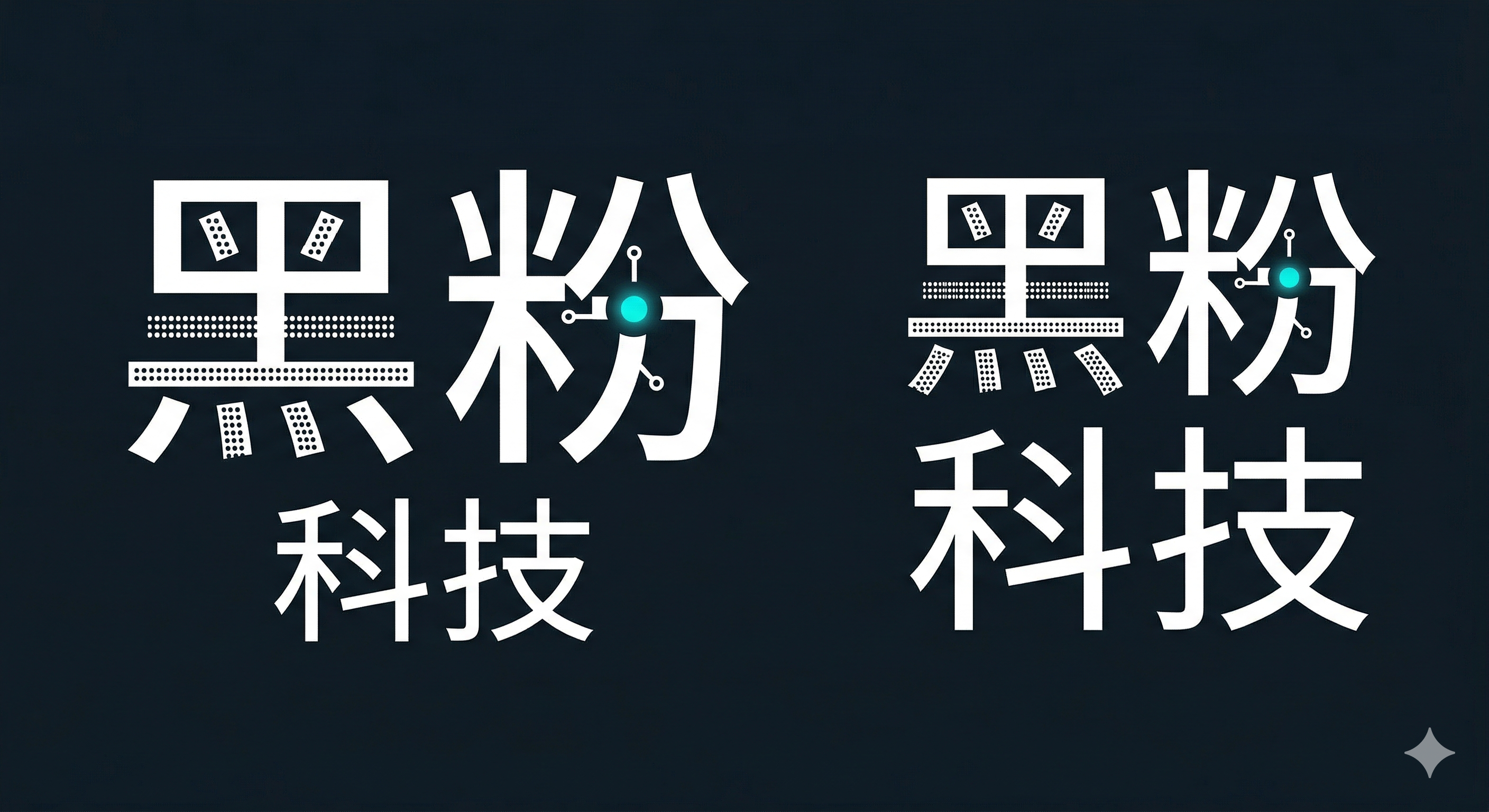
适合:品牌名称本身有设计潜力(中文笔画多、英文字母有特殊形状),不需要额外图标。
English:
Typographic logo — transform the Chinese characters "黑粉科技" into
the logo itself, no additional icon or symbol.

Character treatments:
- "黑" (meaning "black"): fill the strokes with a dense pixel/dot-matrix
  grid pattern, as if the character is built from binary data
- "粉" (meaning "powder/fan"): transform the "米" radical into a circuit
  node with 4 traces extending outward from the center
- "科技" (meaning "technology"): clean geometric sans-serif, 60% the size
  of the first two characters, positioned as a subtitle below

Color rules:
- All text white on dark background (#0F1923)
- ONE single accent: a glowing cyan (#13C2C2) dot at the center node of "粉"
- No other colors, no gradients

Layout: show both a horizontal lockup (single line) and a stacked version
(黑粉 on top, 科技 below).

Style: flat vector, no shadows, no 3D effects. Think Swiss typography meets
Chinese calligraphy structure.
中文:
纯文字 Logo——将"黑粉科技"四个中文字本身变成 Logo,不添加任何额外图标。

每个字的处理方式:
- "黑"(意为黑色):笔画内部填充密集的像素/点阵网格,仿佛这个字是用二进制
  数据构建的
- "粉"(意为粉末/粉丝):将"米"字偏旁变形为电路节点,从中心向外延伸 4 条
  电路走线
- "科技"(意为科学技术):使用干净的几何无衬线体,大小为前两个字的 60%,
  作为副标题放在下方

颜色规则:
- 所有文字为白色,深色背景(#0F1923)
- 唯一的色彩点缀:一个发光的青色(#13C2C2)圆点,位于"粉"字的中心节点
- 不允许其他颜色,不允许渐变Z

布局:同时展示横排版(一行)和竖排版(黑粉在上,科技在下)两种排列。

风格:扁平矢量,无阴影,无 3D。想象瑞士排版设计遇上中文书法结构。
使用要点:
- 中文字变形 Logo 是 AI 的弱项,可能需要 3-5 轮迭代
- 生成后几乎一定需要手动用矢量工具(Figma/AI)微调
通用填空模板
不想用上面的具体 prompt?用这三个模板填空即可。把 [方括号] 内容替换成你自己的信息。
模板 A — 品牌信息完整版
English:
Minimal geometric logo for "[YOUR_BRAND_EN]" ([YOUR_BRAND_CN]).

Brand identity:
- Industry: [YOUR_INDUSTRY, e.g. tech education / fitness / food]
- One-line mission: [YOUR_MISSION, e.g. "help regular people learn AI"]
- Personality: [3-5 TRAITS, e.g. professional, approachable, modern]

Visual rules:
- Primary color: [PRIMARY_HEX, e.g. #13C2C2]
- Accent color: [ACCENT_HEX, e.g. #FFB300] — use sparingly, only one small element
- Background: [BG_HEX, e.g. #0F1923]
- Text color: [TEXT_HEX, e.g. #E8E8E8]
- Style: flat vector, no gradients, no shadows, SVG-friendly
- Must be recognizable at 32x32px (favicon/avatar size)

Icon concept: [DESCRIBE YOUR ICON IDEA, e.g. "merge letters H and T into a doorway shape"]

Below the icon: "[中文名]" in [TEXT_HEX] bold sans-serif, "[ENGLISH_NAME]" in [PRIMARY_HEX] monospace.
中文:
为"[你的品牌中文名]"([你的品牌英文名])设计极简几何 Logo。

品牌信息:
- 行业:[你的行业,如 科技教育 / 健身 / 美食]
- 一句话定位:[你的使命,如 "帮普通人学会用AI"]
- 气质:[3-5个关键词,如 专业、亲切、现代]

视觉规则:
- 主色:[主色 hex 值,如 #13C2C2]
- 点缀色:[点缀色 hex 值,如 #FFB300] — 仅用于一个小元素
- 背景:[背景色 hex 值,如 #0F1923]
- 文字色:[文字色 hex 值,如 #E8E8E8]
- 风格:扁平矢量,无渐变,无阴影,适合 SVG
- 缩到 32x32px 仍能辨认

图标概念:[描述你的图标创意,如 "将字母 H 和 T 融合成一扇门的形状"]

图标下方:[中文名] 用 [文字色] 粗体无衬线体,[英文名] 用 [主色] 等宽字体。
模板 B — 30 秒极简版
English:
Minimal flat logo for "[BRAND_NAME]". Icon: [ONE_SENTENCE_DESCRIPTION,
e.g. "letters A and B merged into a lightbulb shape"]. Colors: [PRIMARY]
on [BACKGROUND], one small [ACCENT] accent dot. Below icon: "[中文名]" +
"[ENGLISH_NAME]". Geometric, clean lines, no gradients, recognizable at 32px.
中文:
为"[品牌名]"设计极简扁平 Logo。图标:[一句话描述,如 "字母 A 和 B 融合成
灯泡形状"]。配色:[主色] 配 [背景色],一个小 [点缀色] 圆点。图标下方:
"[中文名]" + "[英文名]"。几何风、干净线条、无渐变、缩到 32px 可辨认。
模板 C — 迭代精修版(第一轮不满意时用)
English:
Refine this logo. STRICT RULES:
(1) KEEP: [WHAT_YOU_LIKED, e.g. "the doorway shape"]
(2) REMOVE: [WHAT_YOU_DISLIKED, e.g. "all triangles and arrows"]
(3) ENHANCE: [WHAT_TO_STRENGTHEN, e.g. "make the door feel more open"]
(4) Colors: [PRIMARY] structure + ONE small [ACCENT] accent only
(5) Flat vector, no gradients, legible at 32px
(6) Below icon: "[中文名]" + "[ENGLISH_NAME]"
中文:
精修这个 Logo,严格遵守以下规则:
(1) 保留:[你喜欢的部分,如 "门的形状"]
(2) 去掉:[你不喜欢的,如 "所有三角形和箭头"]
(3) 加强:[需要强化的特征,如 "让门看起来更开放"]
(4) 颜色:[主色] 结构 + 仅一个 [点缀色] 小元素
(5) 扁平矢量,无渐变,缩到 32px 可辨认
(6) 图标下方:"[中文名]" + "[英文名]"
选择指南
| 你的状态 | 推荐策略 | 预计轮数 |
|---|---|---|
| 完全没想法,从零开始 | 策略 1(从零探索)→ 然后用策略 2 精修 | 4-6 轮 |
| 知道自己想要什么形状和颜色 | 策略 2(精准描述) | 1-3 轮 |
| 看到喜欢的 Logo 想做类似的 | 策略 3(逆向还原) | 2-4 轮 |
| 能描述感觉但没画面 | 策略 4(关键词爆破) | 3-5 轮 |
| 喜欢某种设计风格但不确定 | 策略 5(风格迁移)→ 然后用策略 2 | 3-5 轮 |
| 品牌名自带设计感 | 策略 6(文字变形) | 3-5 轮 + 手动微调 |
5 条铁律
- 先想后做:颜色、气质、寓意想清楚再开 AI,否则 AI 只能瞎猜
- 给 Hex 色值:不要说"蓝色",要说
#13C2C2——AI 出色准 10 倍 - 负面约束必写:
no gradients, no shadows, no 3D, no gears比写你想要的更有效 - 32px 测试:把结果缩到拇指大小,还能认出来才算合格 Logo
- 多生多选:每次生成至少要 4 张,从中挑最好的继续迭代
工具推荐
| 工具 | 免费额度 | 强项 |
|---|---|---|
| Gemini (Google) | 免费 | 概念探索,中文理解好 |
| DALL-E 3 (ChatGPT) | Plus 订阅 | 风格控制精准 |
| Ideogram | 免费额度 | 文字渲染最准 |
| Midjourney | 订阅制 | 设计感最强 |
| 即梦 (Jimeng) | 免费 | 中文提示词友好 |
| 通义万相 | 免费 | 中文支持好 |
分享到: